There is no doubt that Garmin has the lion's share in the cycling computer market. Sometimes, the comfort of a familiar OS and ecosystem is just too much of an allure to change things up. However other times, life isn't about being comfortable. There are times where you'll want to try different things... just for the sake of it. For example, trying the product for yourself and making decisions, instead of following what marketing departments of giant corporations tell you.
With this in mind, going to a Wahoo bolt from an equivalent Garmin might feel awfully similar to say, moving to an Apple ecosystem after years of using Windows. However judging by our first impressions, the change is incredibly simple and highly pleasurable.


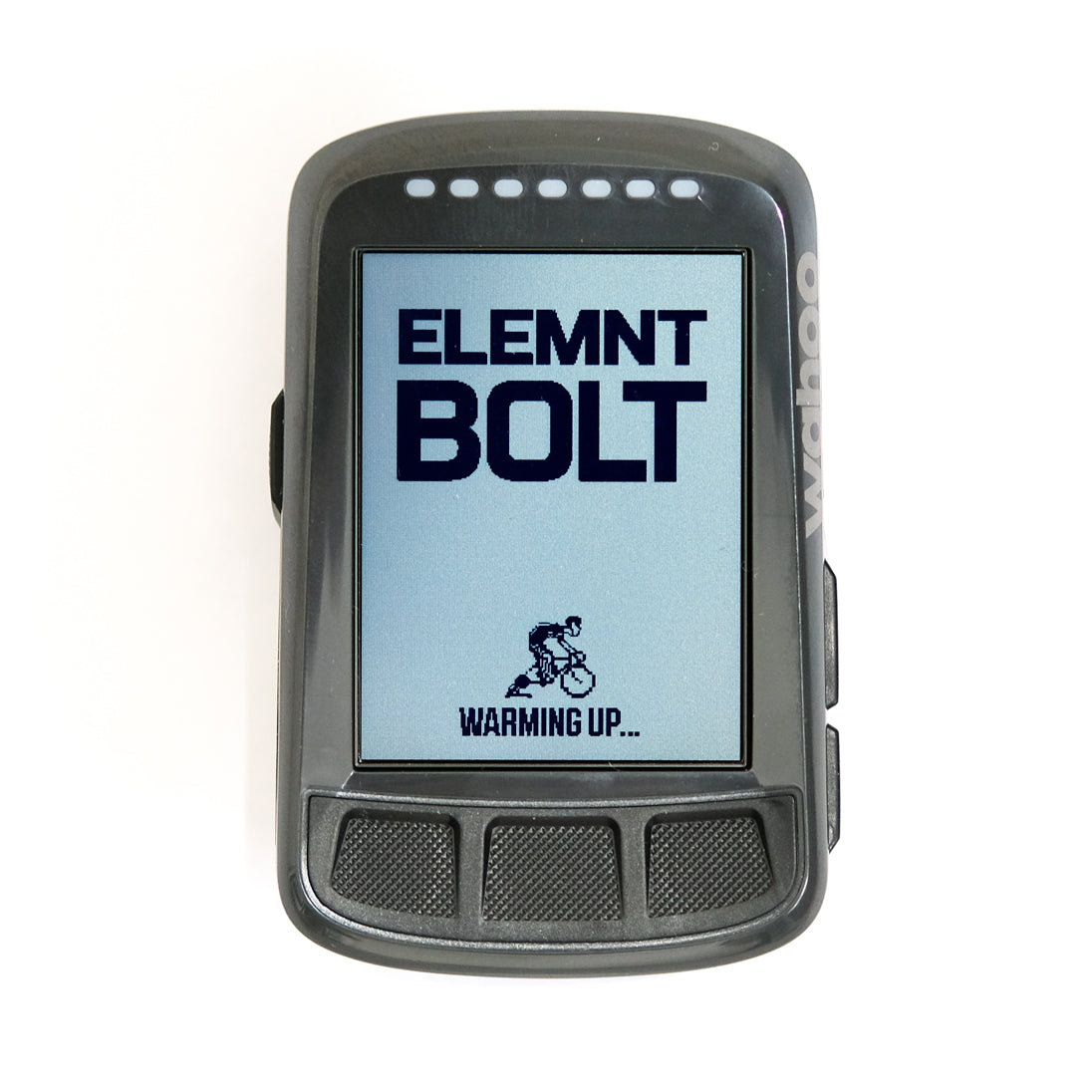
Out of the box, the Wahoo unit is unassuming. It is mostly dark plastic and looks inoffensive. It is sized similarly to the Garmin 5xx/820 series.

The Bolt starts up in 29.85 seconds.

Your first sign that this is not a Garmin starts from the smartphone pairing experience. The pairing consists of a QR screen on the Bolt and by using the Wahoo ELEMNT App, you can scan the QR code to pair. Simple as.

Once paired you will be taken to the main menu screen on the app where almost all options are configured. Wahoo has decided (smartly) to keep the bulk of settings on the smartphone app and leave the Wahoo Bolt unit with some very simple menu options such as backlight settings. Stuff you need to adjust on the fly.

The most important page for your settings is the workout data page. By going into this page, you can change what the Wahoo displays. This is all done on the fly, so as you drag and change the order of fields, you can see it reflected on the Wahoo unit.
The ethos behind Wahoo's display is set on a "zoom in, zoom out" concept. By pressing two buttons on the side of the Bolt, you can increase or decrease the amount of fields necessary to your view. Essentially, it is key to set it up with the data in a pyramid structure i.e. your most important data at the top so as you zoom in, that is all you can see. See pictures below for an example.


As previously mentioned, the menu system on the actual Wahoo unit is sparingly bare. You don't have the typical tree menu that Garmin's have.

Wahoo has also blessed the Bolt with physical buttons. The tactility of the three bottom buttons are great but the side ones are a little more finicky but we will take that over a touchscreen any day! One cool thing we noticed is the way the Bolt treats Livetrack. Instead of generating a random link each ride, it gives you the option to send a permanent link which from there can be sent to maybe your close riding buddies/partners so they will know where you are when you are riding and if you are late to the start, etc etc.
So far, first impressions are good. There are little quirks here and there and we are not saying that Wahoo is better than Garmin units, they certainly have different strength but sometimes, it isn't that scary to try something different and that is the ethos behind a lot of the stuff CCACHE sells.
It pays to sometime experiment and make decisions based on your own experience and knowledge!